
The photo order that gets holiday lets booked
· 3 min read
Most hosts spend real money on photography and then upload the gallery in whatever order the files arrived. That throws away a lot of the value. Guests scroll a search page of near-identical cottages, and they decide in the first few images whether to click, and in the first five or six whether to keep going.
A listing gallery is not an archive of the property. It is a short argument for booking, and the order is the argument.
The cover image: sell the stay, not the building
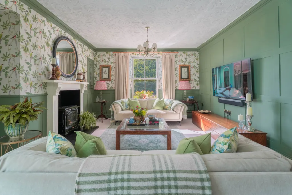
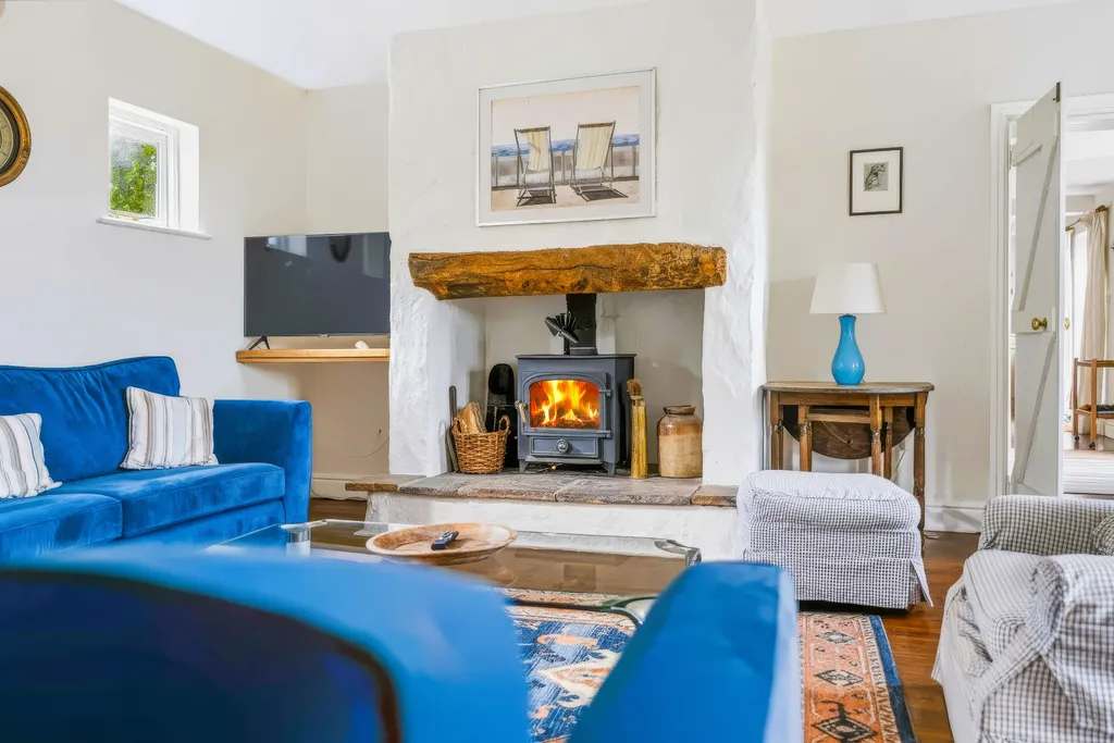
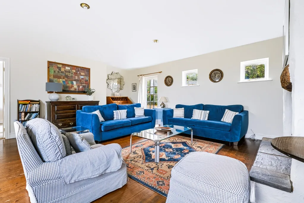
The cover is the only image most people will ever see of your listing. It has one job: make someone stop scrolling. For most West Wales lets that means one of three things: the best living space with natural light and a view out, the defining feature (a wood burner, a hot tub with the coast behind it, a vaulted beam ceiling), or the setting itself when the setting is the reason people come.
What it rarely means is the front of the house. A pleasant cottage frontage looks like every other pleasant cottage frontage at thumbnail size. Unless the exterior is genuinely the draw, save it for later in the sequence.
The first five: answer the booking questions
After the cover, guests are quietly checking a list. Where will we sit in the evening? Where will we sleep? Is the kitchen usable? What is outside? Your next four images should answer those questions in roughly that order, each with the strongest frame you have of that space.
- Cover: the hero living space, feature or setting
- A second angle of the main living space, or the open-plan view that shows how rooms connect
- The kitchen or dining space, ideally laid for a meal
- The best bedroom, bed made tight, light on
- The outdoor space or view: garden, terrace, hot tub, sea
Then walk the guest through the house
After the opening sequence, order the rest as a guest would experience arriving: approach and entrance, living spaces, kitchen, each bedroom followed by its bathroom, then outdoor spaces and the surroundings. Grouping a bedroom with its en suite answers a question guests otherwise message you about.
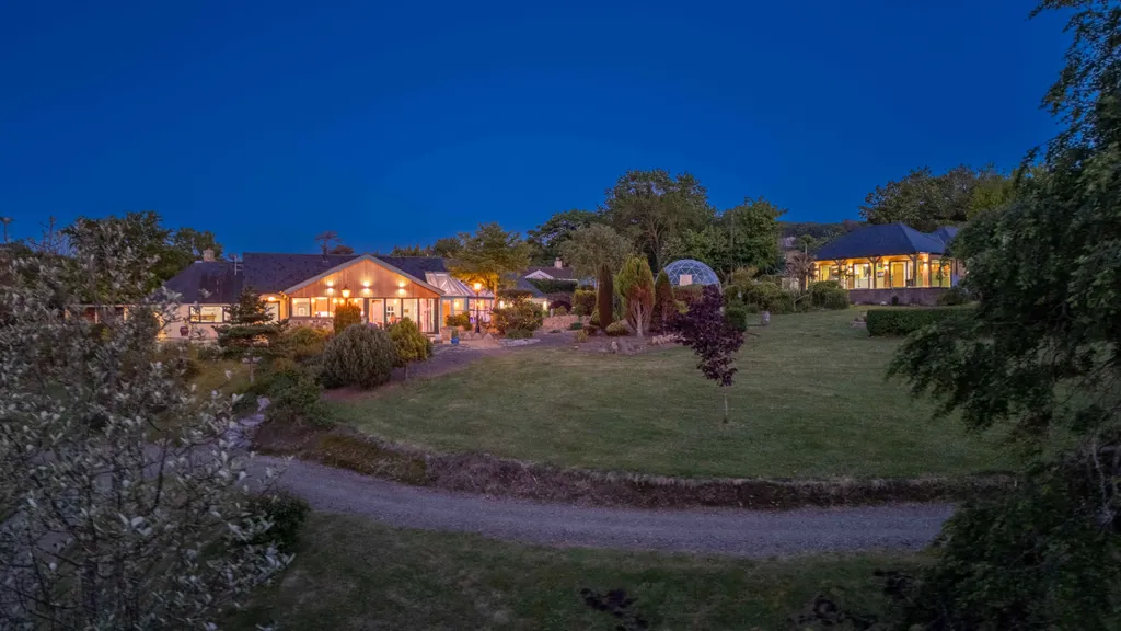
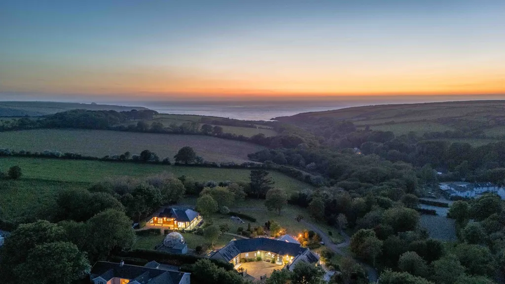
Put the aerials and the local area (the beach, the harbour, the Coast Path) towards the end. They are persuasive, but they are context. Someone who has reached image twenty is already interested; the drone shot of the bay is what tips them.
Leave out the filler
More images are not automatically better. A toilet close-up, three near-identical angles of a single bedroom, an empty utility room: each one dilutes the gallery and makes the good images work harder. If a picture does not answer a question or create a feeling, drop it.
The exception is anything that prevents a complaint. If the second bedroom is a bunk room, show it clearly. If the stairs are steep, show them. Honest images reduce cancellations and bad reviews, which matter more to your ranking than one more pretty frame.
Captions and platforms
Airbnb and Booking.com both let you caption images and assign them to rooms. Use it. A caption like "Main bedroom, king bed, sea view" works for guests who scan and for the platform's own room tour. On your own website, keep the same order but you can be more editorial: fewer images, bigger.
Every Listing Launch we deliver includes a recommended photo order and crops sized for the main booking platforms, so the work of sequencing is done before you upload.
Getting a new let ready for the season?
See the Listing Launch package →More from the journal